Button
Updated 2026-05-14
Confidence anatomy medium variants high motion high a11y high content high
Overview
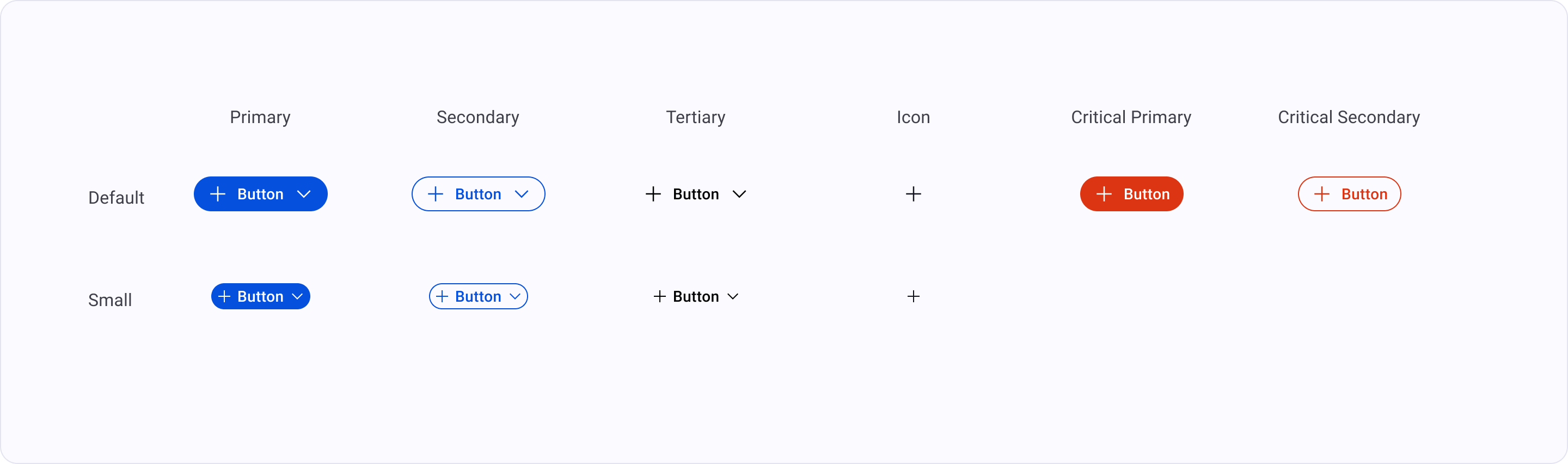
Section titled “Overview”Primary trigger for a specific action or form submission. Use “Primary” for the main task, “Secondary” for alternative actions, and “Ghost/Tertiary” for low-priority tasks.
Primary: “Use as the single most important action on a screen. Limit to one per view (e.g., ‘Submit’, ‘Pay Now’).” Secondary: “Use for supporting actions that are not the main goal of the page (e.g., ‘Cancel’, ‘Back’).” Tertiary/Ghost: “Use for low-emphasis actions or repeated items in a list (e.g., ‘View Details’, ‘Learn More’).” Critical: “Use specifically for actions that result in data loss or permanent changes. Usually styled in Red.”
Anatomy
- 1 Containerthe interactive surface — receives focus, hover, press states
- 2 Labelaction verb in title case; the primary affordance signal
- 3 Leading icon (optional)reinforces the label; decorative when paired with text
- 4 Trailing icon (optional)chevron or external-link glyph for navigation hints
- 5 Loading indicator (optional)replaces label when action is in-flight
Variants
Default | Small |
|
|---|---|---|
Primary | ||
Secondary | ||
Tertiary | ||
Icon | ||
Critical primary | ||
Critical secondary |
Motion
State Transitions
hover/focus/active transitions stay within the 100-200ms band