Modal
Updated 2026-05-14
Confidence anatomy medium variants high motion high a11y high content high
Overview
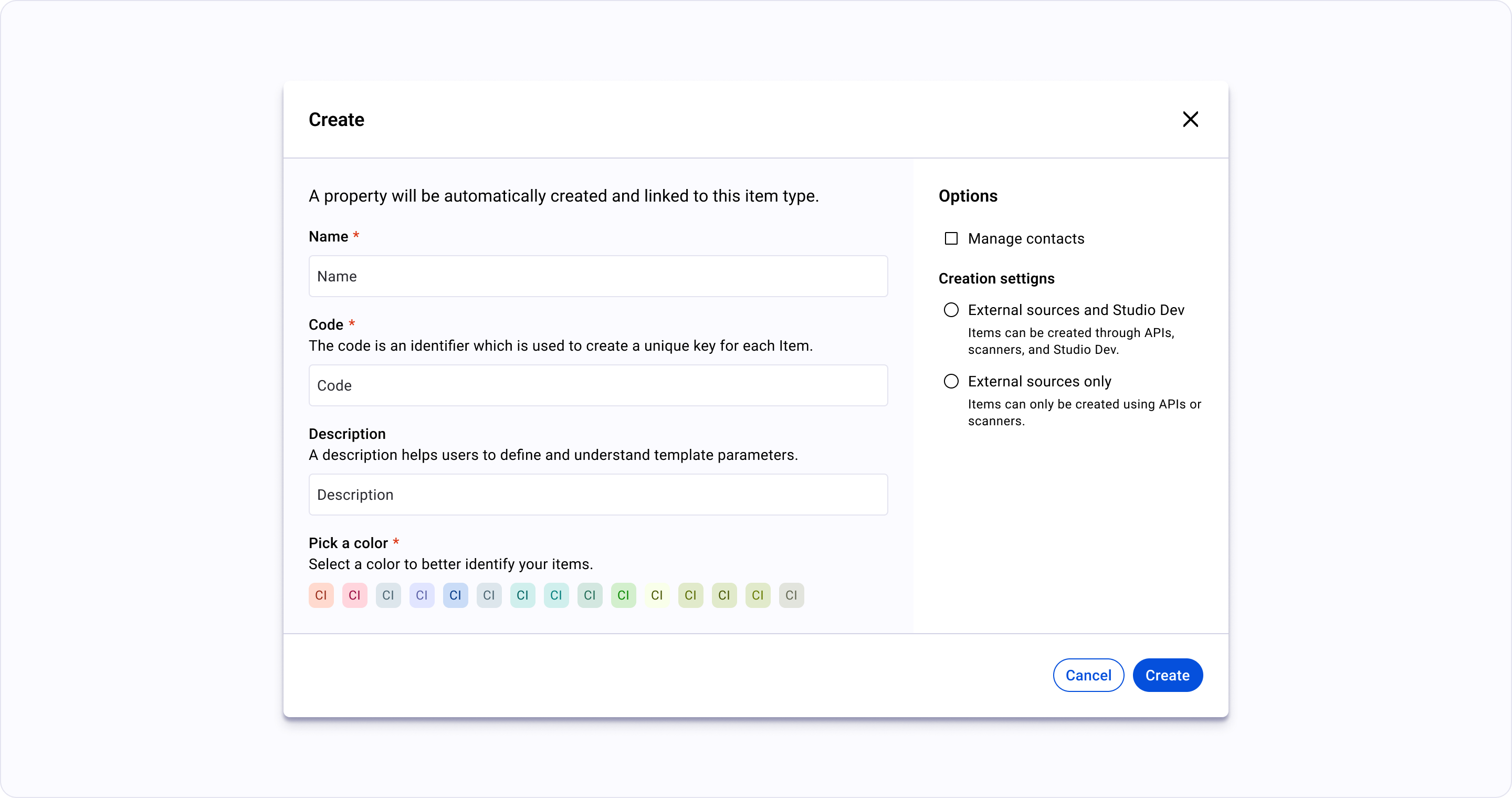
Section titled “Overview”A centered dialog that blocks the main content. Use for critical “Stop and Think” actions, confirmations, or complex data entry that must be completed or cancelled before moving on.
Anatomy
- 1 Triggerthe element that opens the overlay; retains focus return on close
- 2 Surfacethe overlay panel itself — modal dialog, drawer, popover, tooltip
- 3 Scrim (optional)dimmed backdrop used for modals + drawers; absent for popovers/tooltips
- 4 Header (optional)title + close affordance for dismissible overlays
- 5 Bodythe overlay's primary content
- 6 Footer (optional)action affordances — confirm/cancel/close
- 7 Arrow or pointer (optional)anchors popovers/tooltips to their trigger
Variants
🟢 Ready |
|
|---|---|
700px setting | |
1200px | |
900px create | |
900px edit | |
700px create | |
450px warning | |
450px confirm |
Motion
Layered Overlays — Modals
modals fade + scale; scrim cross-fades
Drawer (open/close)
drawer-side-panel slides on axis with easing per the drawer pattern
The "Anchor" Motion — Dropdowns, Popovers, and Tooltips
popover/tooltip anchor open at the trigger with origin transform