App switcher dropdown
Updated 2026-05-19
Confidence anatomy medium variants medium motion high a11y high content low
Overview
Section titled “Overview”Menu: -4 Density Menus display a list of choices on a temporary surface. They appear when users interact with a button, action, or other control.
🛠 Additional options Menu list item - can be edited by selecting individual list item and selecting wether it is enabled, selected, and has a divider from the variant properties.
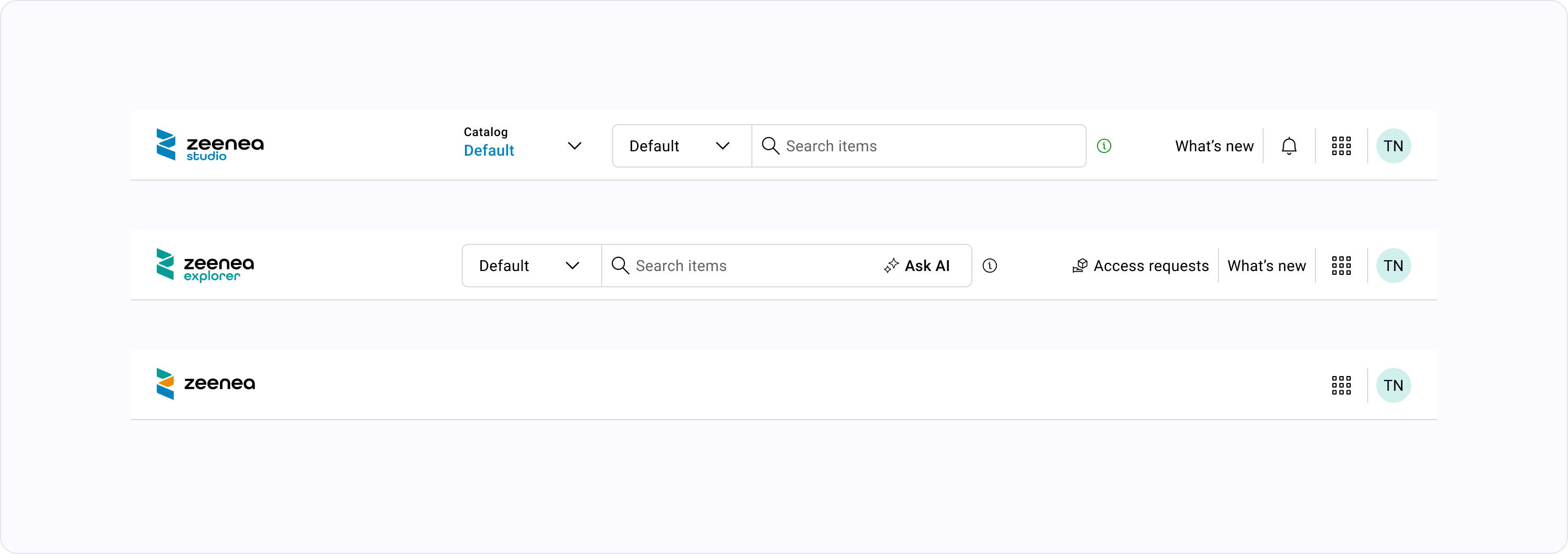
Anatomy
- 1 Containerthe navigation region — typically a landmark role (nav/banner)
- 2 Itemsindividual navigable entries; one is marked "current" when applicable
- 3 Item labelshort, scannable text; never sentence case
- 4 Item icon (optional)reinforces meaning at a glance; not a substitute for label
- 5 Active indicatorvisual treatment for the current item — underline, bar, fill, or background
- 6 Trigger (optional)opens a dropdown/menu for grouped or contextual items
Variants
compact | comfortable |
|
|---|---|---|
horizontal | ||
vertical |
Motion
State Transitions
hover/focus transitions on items stay subtle — no large translation
The "Anchor" Motion — Dropdowns, Popovers, and Tooltips
dropdown triggers (account-dropdown, notification-dropdown, etc.) anchor to their button