Drawer, side panel
Updated 2026-05-19
Confidence anatomy medium variants high motion high a11y high content medium
Overview
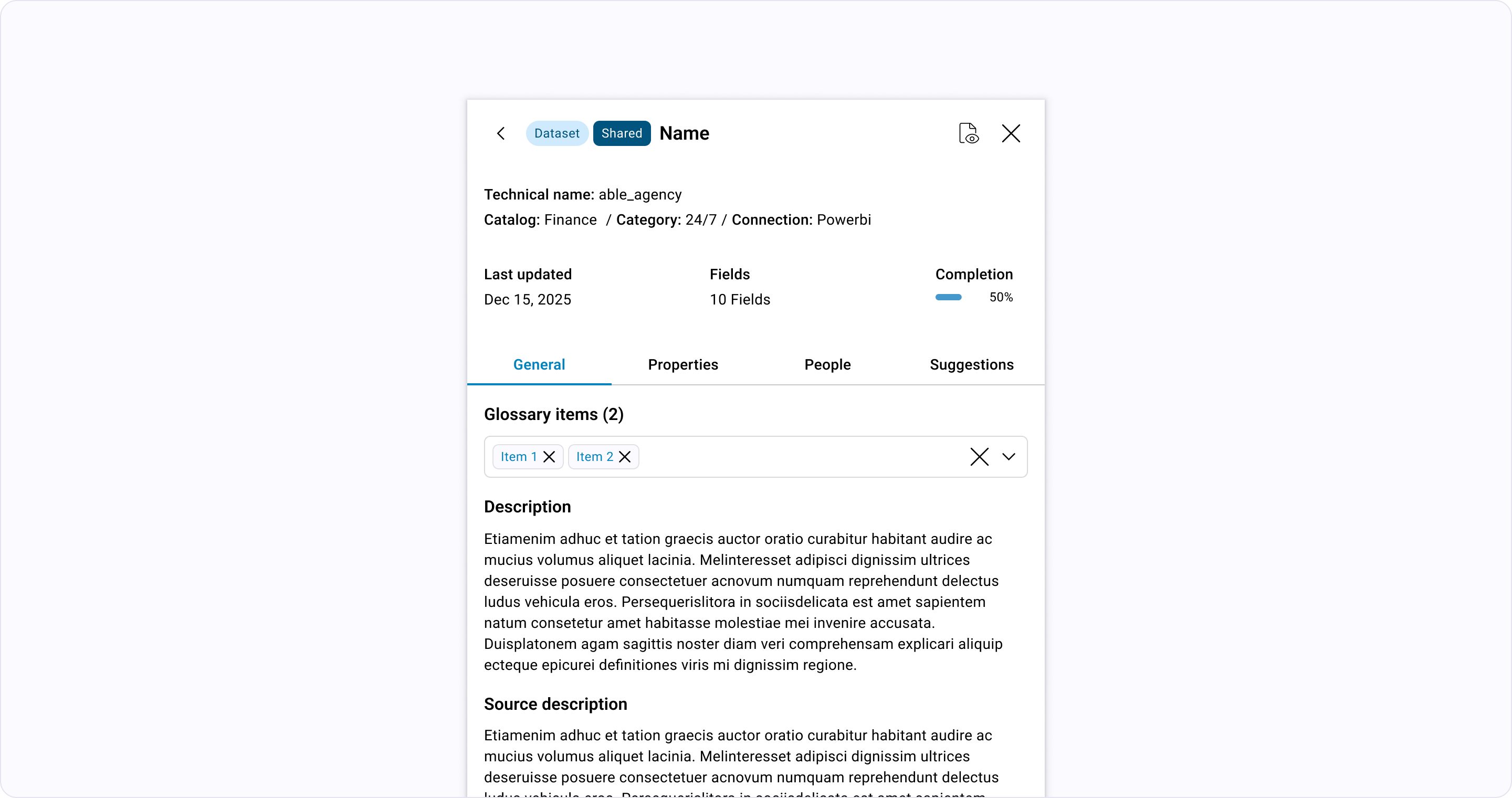
Section titled “Overview”A container that slides from right side of the screen. Use for secondary tasks that require high focus but need to maintain the context of the main page.
Anatomy
- 1 Triggerthe element that opens the overlay; retains focus return on close
- 2 Surfacethe overlay panel itself — modal dialog, drawer, popover, tooltip
- 3 Scrim (optional)dimmed backdrop used for modals + drawers; absent for popovers/tooltips
- 4 Header (optional)title + close affordance for dismissible overlays
- 5 Bodythe overlay's primary content
- 6 Footer (optional)action affordances — confirm/cancel/close
- 7 Arrow or pointer (optional)anchors popovers/tooltips to their trigger
Variants
| App |
|---|
Studio |
Explorer |
Motion
Layered Overlays — Modals
modals fade + scale; scrim cross-fades
Drawer (open/close)
drawer-side-panel slides on axis with easing per the drawer pattern
The "Anchor" Motion — Dropdowns, Popovers, and Tooltips
popover/tooltip anchor open at the trigger with origin transform